An integrated solution for research and booking appointments
What
a new online portal for an archive
Timeline
nine months, alternating between design and development
Team
IT Manager, Head of Digital Infrastructure, Head of Collections, developer, me
About this project
The Brandenburg Main State Archive (BLHA) is one of 16 regional state archives in Germany responsible for preserving administrative and historical records at the state level.
I was tasked with evaluating and redesigning the UX of the archive's new online platform, nine months before its launch. An MVP had already been developed in-house with a focus on functionality, and I was brought in to ensure it would also meet users' needs.
The platform brings together functions previously scattered across disjointed online tools and even paper forms: searching the catalogue, organizing findings, registering with the archive and booking in-person reading room appointments.
Over three iterative rounds of usability testing and refinement, we addressed various friction points, resulting in a more intuitive experience that is easier to navigate for the main user groups.
Process
Research & Analysis
↓
Testing
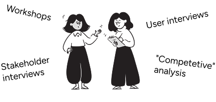
We did moderated usability tests with 12-15 participants per round, divided into three user groups: professional researchers, hobby researchers and first-time users. All were recruited by reaching out to the archive's user base and staff. Participants were given scenario-based tasks, which had been developed in a cross-functional workshop.
↓
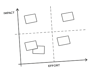
Prioritization
We prioritized fixes based on impact and feasibility. Given the existing codebase, limited development resources, and launch timeline, we focused on changes that would have the highest impact on user success.
↓
Ideation & Design
↓
Implementation
3 ROUNDS
About the users
Around 50% are one-time users who need a single record and won't return. Among the returning users many visit infrequently enough that they have to relearn how the archive works each time.
Beyond professional researchers, the regular user base includes hobby historians and genealogists, many retired. While comfortable with computers, (sidenote:
Some examples:
Caution: Higher distrust of unfamiliar features, especially around account security.
Problem-solving: When encountering obstacles, participants were more likely to assume they'd made an error than to experiment with different solutions.
Navigation: Preference for linear navigation using the back button rather than tabs.
Terminology: Some web conventions were interpreted differently: "Home" was sometimes understood as "Imprint" or "Contact."
).
We therefore optimized for first-time use, not repeat efficiency. The interface needed to make sense immediately, provide ample explanation and use patterns people already know from other contexts.
Selected problems and solutions
Testing revealed issues across all areas of the platform. We prioritized the registration and booking process because shortcomings here would burden the archive with avoidable support requests. By contrast, the task of finding the right archival records is inherently complex. It might require human assistance for the foreseeable future—and that's fine. But booking appointments needed to be something users could do independently.
The three examples below illustrate which issues we encountered and how we solved them.
Most records at the archive aren't digitized and can only be viewed in person. This requires a multi-step process: users must first (sidenote:
A reader's ticket is like a library card for archives that grants you permission to access records in the reading room. To obtain one, one typically needs to register with the archive and explain one's research purpose, though in Germany archives can't arbitrarily deny access to materials that fall within the legal access periods.
), then order the records and book a reading room appointment far enough in advance so that the materials are ready when they arrive.
The problem
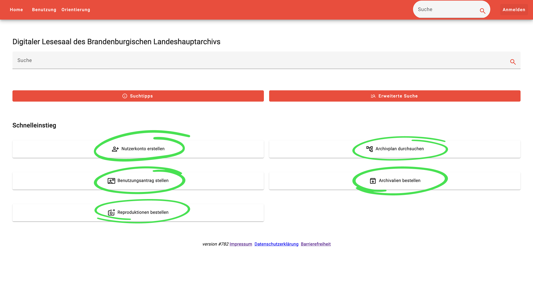
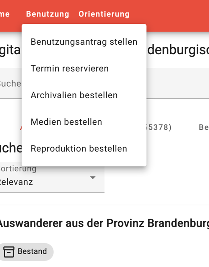
Previously, these functions were scattered across multiple online tools and paper forms. When consolidating them into the new platform, the team took a natural first approach that later proved problematic: they created a dashboard structure, with all functions linked from the homepage and main navigation.
The issue: the actions need to be taken in a fixed order. A dashboard structure affords too much freedom and too little guidance.
The first round of usability testing confirmed this decisively. Users struggled to start the ordering process, didn't know what to do next and couldn't complete an order independently.
Solution
For first-time archive users, the ordering process is entirely unfamiliar. There is, however, an analogous process they know well: buying something online. Online shopping has solidly established UX patterns that we can borrow from.
I adapted the familiar stepped checkout flow, tweaking it to accommodate the archive's specific requirements. Users are now guided through the process, which has (sidenote:
For the task of placing the first order, the task completion rate went from 42% to 100%.
).
Challenge
The checkout flow abstracted away internal processes and waiting periods that the MVP had surfaced explicitly. Early in the project, there was skepticism about whether this change would disrupt the normal workflows at the archive. We addressed these concerns in two ways. First, rather than pushing through all changes at once, we took small incremental steps that were easier to agree on. Second, I shared footage from usability testing sessions with stakeholders across different departments, which helped build confidence in the approach and helped them recognize unnecesary complexity. Finally, when the platform launched, the streamlined process integrated smoothly with existing operations.
BEFORE
All functions were linked from the homepage (circled green) and from the main navigation, providing not enough guidance. If users didn't execute them in the right order, they were instructed what to do next.
AFTER
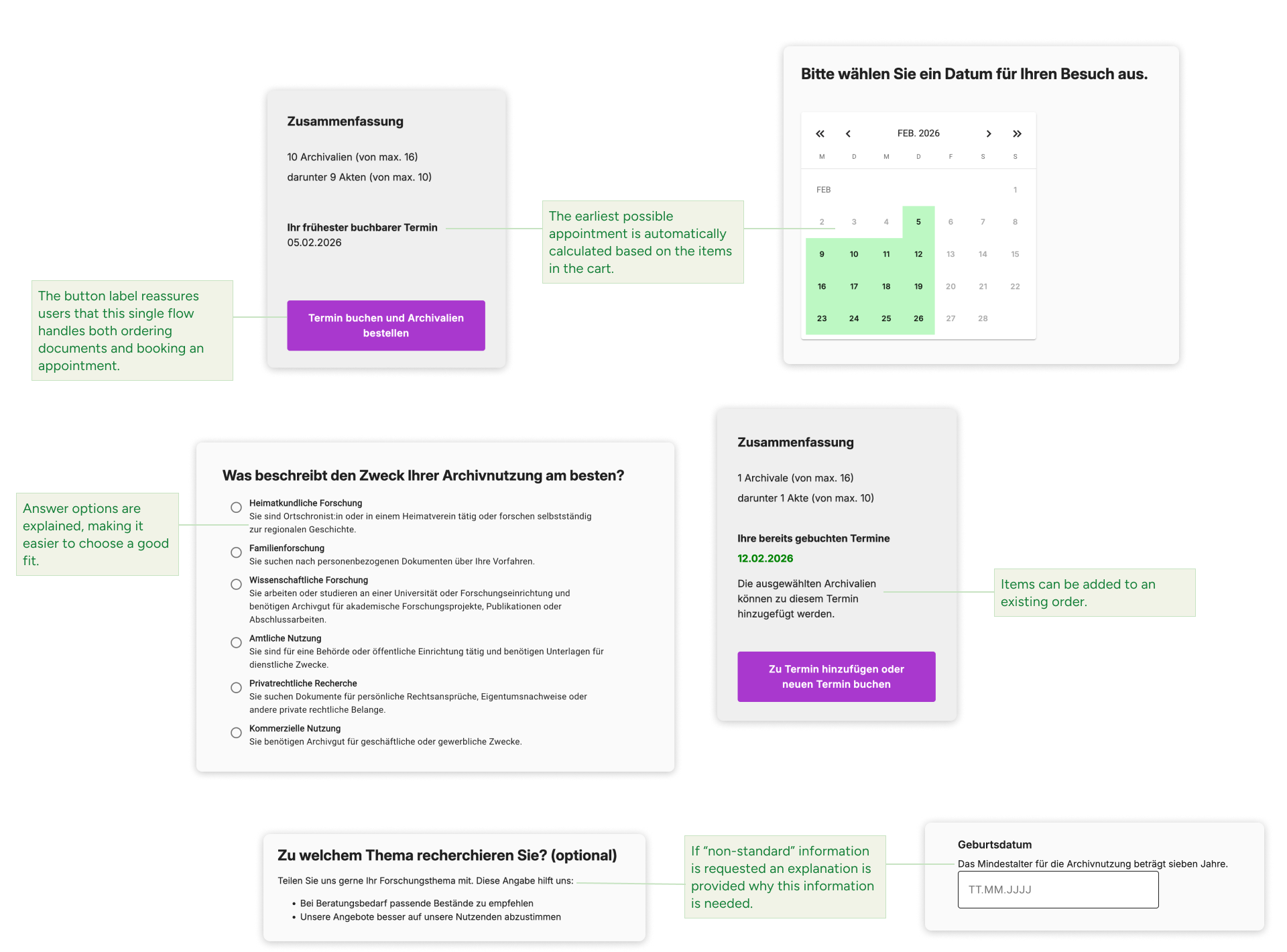
The redesign uses a checkout flow to guide users through the booking process.
Examples of context-aware guidance
The button label reassures users that this single flow handles both ordering archival records and booking an appointment.
The earliest possible appointment is automatically calculated based on the items in the cart.
Answer options are explained, making it easier to choose a good fit.
Items can be added to an existing order.
If "non-standard" information is requested an explanation is provided why this information is needed.
Not every record in the archive can be freely accessed. Some are restricted for privacy concerns, others for legal reasons, and some due to their physical fragility. These access rules are a crucial part of the user journey and need to be communicated.
The problem
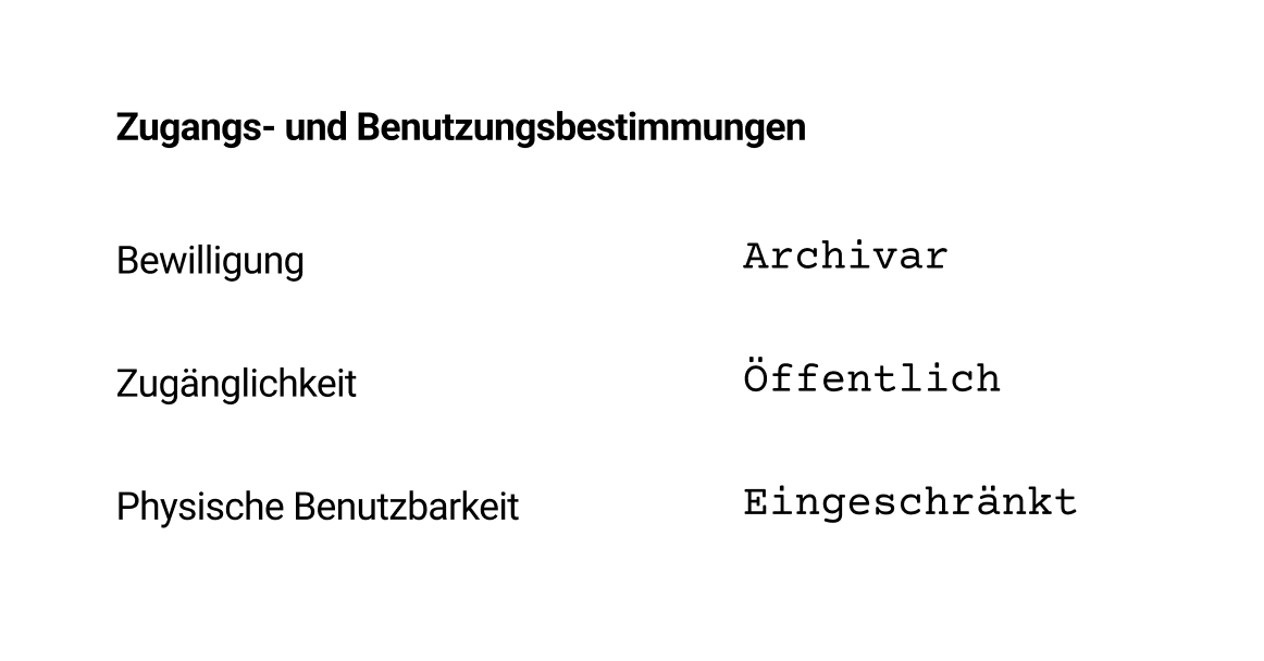
The MVP used hard-to-interpret legal references and single-word descriptions, partly buried in the metadata. During testing users struggled to interpret this information.
Solution
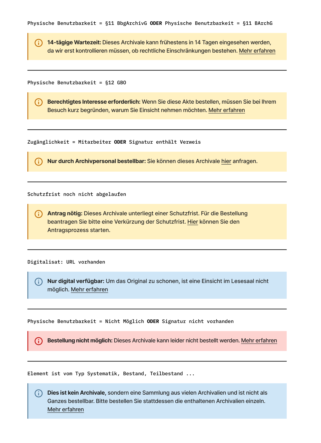
I sat down with an archivist to learn about all possible metadata configurations, then translated them into plain-language—sometimes departing significantly from the original phrasing. These descriptions are displayed in color-coded boxes on the search results and the record detail pages.
(sidenote:
To verify comprehension, I asked participants to order documents with various restrictions, and afterwards discussed how they interpreted the constraint. This revealed not just whether they saw the information, but whether it made sense in context.
) helping them accept constraints rather than feel frustrated about unexplained restrictions.
BEFORE
Restrictions were described using vague terms like "restricted" or "public" paired with legal paragraph references.
AFTER
Constraints are explained in plain language with color-coded boxes that clearly communicate what users can and cannot do.
Key refinements
Contextual help: Each box links to relevant articles. In testing, 54% of users clicked these links, indicating that many users are curious about the "why" behind restrictions.
Direct action paths: When workarounds exist (like requesting special access), users can initiate the process with one click instead of drafting an email from scratch.
Accessible disabled states: When items can't be ordered, the add-to-cart button is disabled, but remains keyboard-accessible with explanatory text shown below.
Tone shift: The language is more actionable and approachable than the archive's typical formal style.
Of the archive's total records, 2% are available as digital copies and can be viewed online. (sidenote:
Alternatively, users can have a digital copy made specifically for them. This paid service is currently managed via email but planned for future integration into the platform.
)
The problem
First-time users often expect to view all records online. When they can't find a scan, they assume they're searching incorrectly or lack proper permissions, rather than recognizing the material simply isn't digitized yet.
Solution
Rather than stating outright "most records aren't digitized", which would feel unprompted and jarring, (sidenote:
Testing showed why this layering matters: individual cues were missed or misinterpreted by some participants, but the cumulative effect worked. 92% of users understood that a digital copy wasn't available before starting the booking process; the remaining 8% realized it during checkout.
) around two strategies:
Make existing digital copies highly discoverable. When users know exactly where to look for digitized records, they can quickly confirm availability themselves.
Guide users toward in-person appointments as the default: Button labels, microcopy and help content frame visiting the archive as the expected path.
Making digital copies discoverable
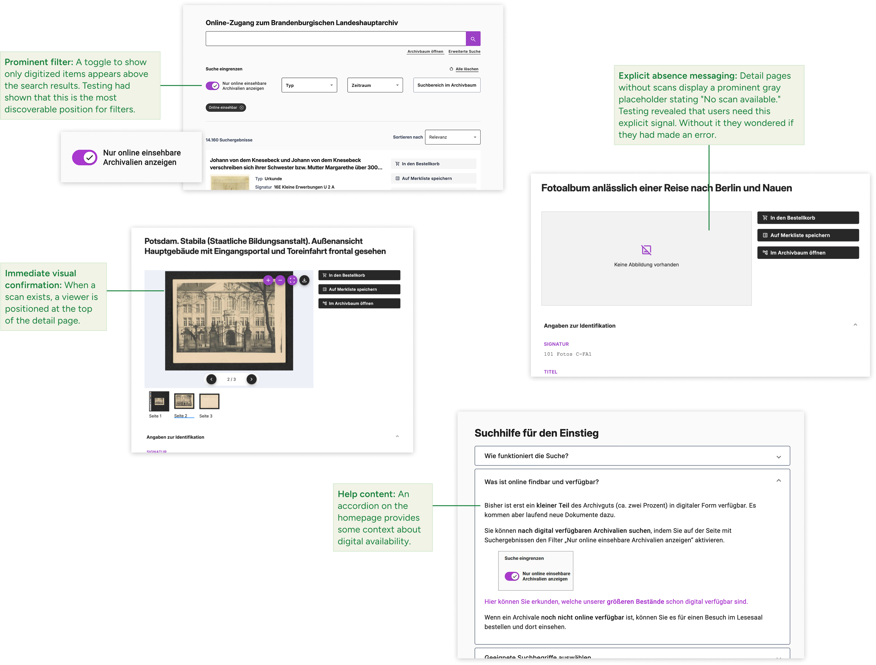
Prominent filter: A toggle to show only digitized items appears above the search results. Testing had shown that this is the most discoverable position for filters.
Immediate visual confirmation: When a scan exists, a viewer is positioned at the top of the detail page.
Explicit absence messaging: Detail pages without scans display a prominent gray placeholder stating "No scan available." Testing revealed that users need this explicit signal. Without it they wondered if they had made an error.
Help content: An accordion on the homepage provides some context about digital availability.
Guiding users towards in-person as the default
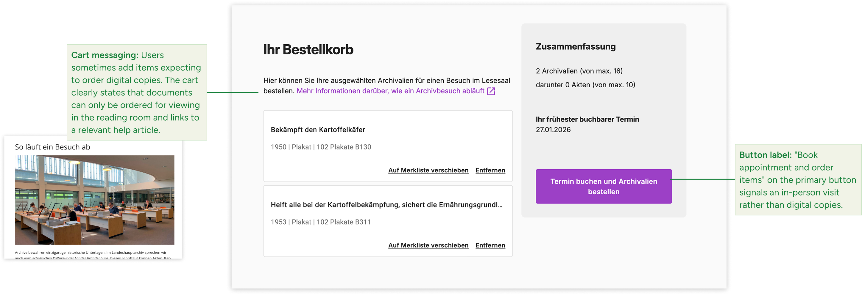
Cart messaging: Users sometimes add items expecting to order digital copies. The cart clearly states that documents can only be ordered for viewing in the reading room and links to a relevant help article.
Button label: the primary button in the cart is labeled "Order items and book appointment", signaling an in-person visit rather than digital copies.
This was my first project working primarily with older users. The usability tests with this group were especially eye-opening for me, and I think the stakeholders felt the same way. I involved them in the process by co-developing the test tasks, watching clips from the video recordings, and discussing the results together. This really helped build shared understanding.
What worked well: I managed to consistently advocate for user needs and push back when technical barriers were just assumed. This opened up solutions that initially seemed off the table.
What I'd do differently: First, I'd spend more time understanding internal workflows upfront—not just through interviews, but through field observation and by shadowing staff. Interviews are great for organizational context, but certain day-to-day details only emerge in the field. This would have helped me design solutions that fit existing processes more smoothly from the start.
Second, the timing between design and development was not always aligned well. Next time, I'd try to decouple design more—for instance, through more frequent testing with low-fidelity prototypes. That way, design could iterate faster while development follows at a steadier pace.
That said, the three testing rounds over several months had an important upside: they gave everyone time to digest insights and embrace new approaches. The project brought the whole organization along, not just the core team.
Looking ahead: The platform now has a stable, modular foundation that was developed in-house. Future improvements can be implemented incrementally without having to overhaul everything. Next up, I'd tackle the search function—it should better support both exploratory browsing and targeted searching.